Introduction
Bourntec Solutions, founded in 1994, provides IT management, technology advisory, and digital transformation services. With expertise in software, data, and cloud engineering, they deliver innovative solutions globally from their headquarters in Chicago and operational centers worldwide.
Role
User research, wireframes, prototype
Team
1 Project manager, 1 UX Designer (me), 1 developer
THE CONTEXT
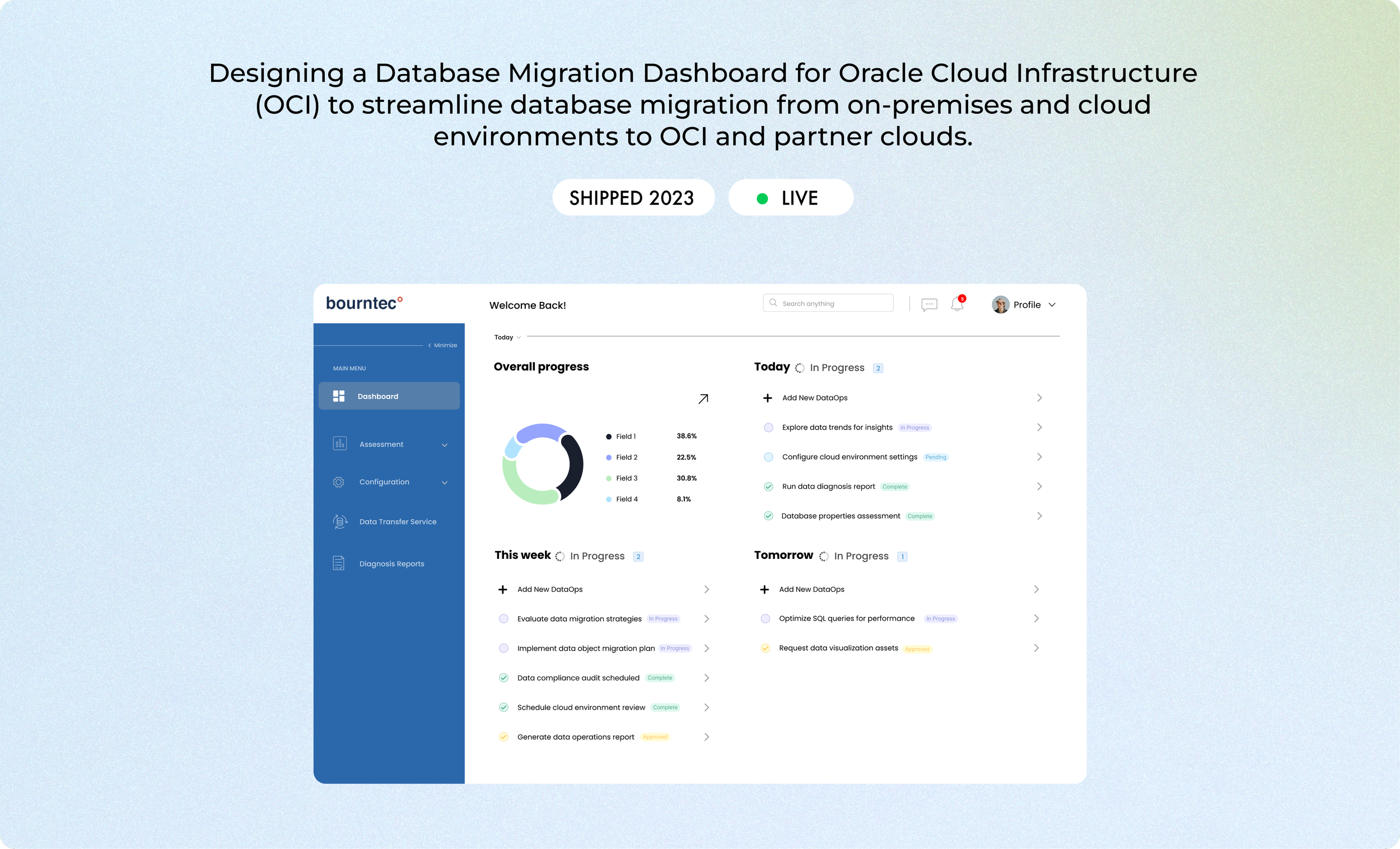
Designing a Database Migration Dashboard for Oracle Cloud Infrastructure (OCI) to streamline database migration from on-premises and cloud environments to OCI and partner clouds.
At Bourntec Software Solutions, I developed a high-fidelity prototype for a Database Migration dashboard that would make the migration process straightforward for a range of users. During this project, I identified opportunities to improve navigation and simplify complex technical workflows. This required a competitive analysis of the market landscape and user flow mapping to ensure a seamless experience. Collaborating closely with a product manager and developers under a tight, two-month deadline, I focused on creating a design that met user needs and facilitated quick implementation.
WHERE WE STARTED
I began with a market analysis, navigating limited resources since many comparable tools are internal. To ensure a cohesive and consistent experience, I familiarized myself with our existing design system and studied similar tools within the company.
With the initial groundwork complete, we shifted to brainstorming the key pages and essential navigation links for the new dashboard. This was followed by card sorting exercises and mapping out user flows to ensure intuitive structure and accessibility.
Using research and various exercises, we developed a thorough understanding of the dashboard requirements, setting a strong groundwork for the platform.
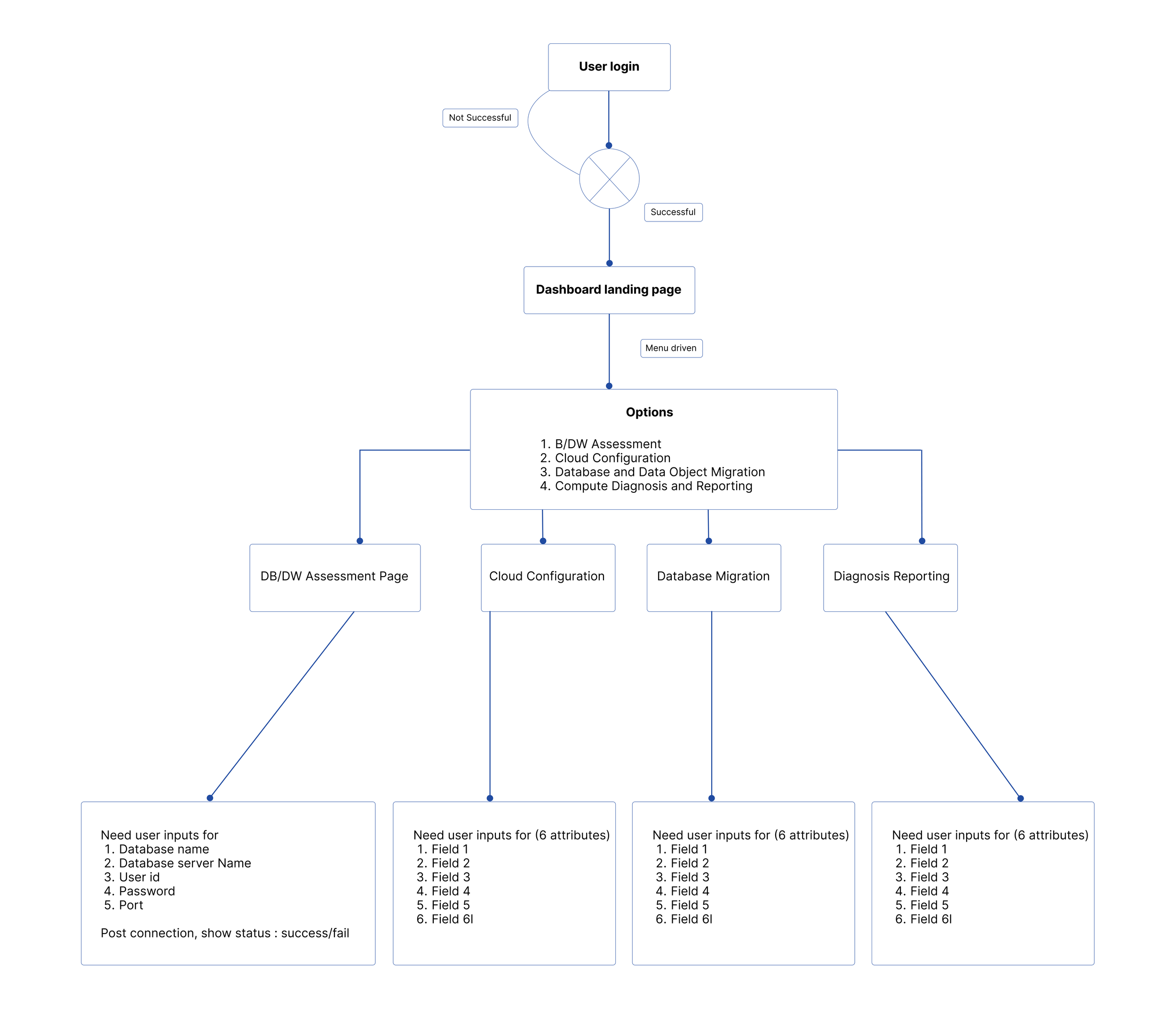
Sitemap
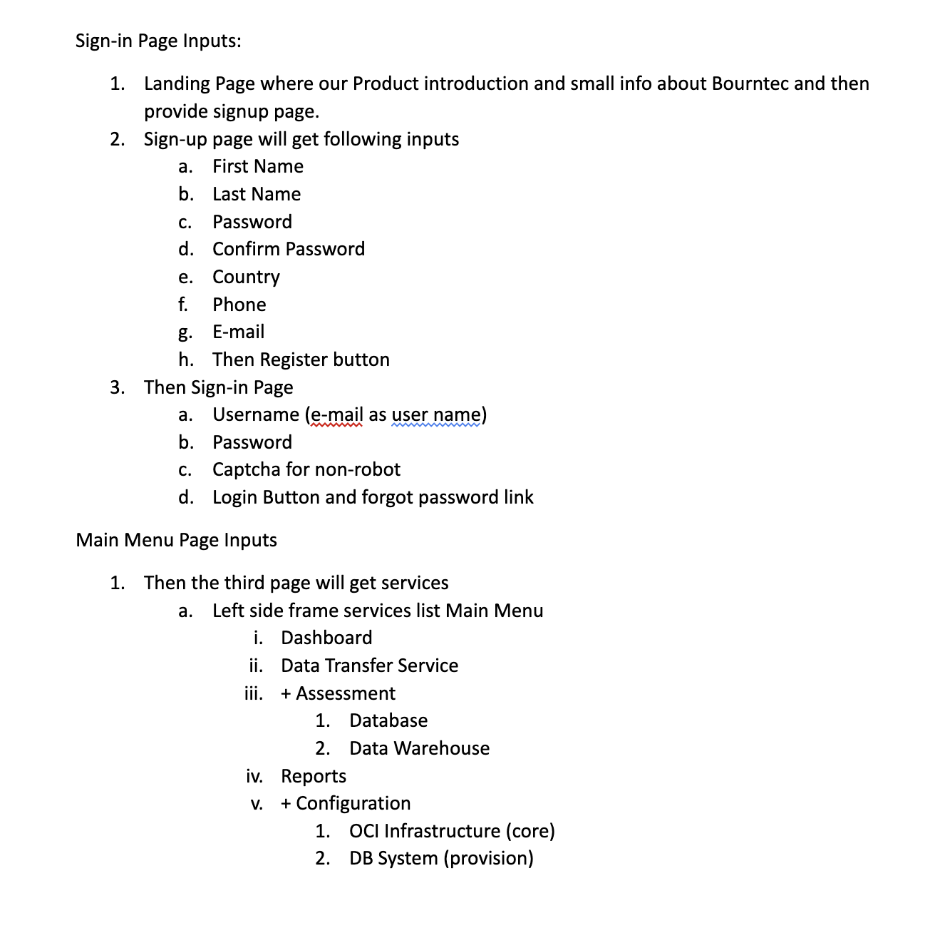
Breakdown of important pages
WIREFRAMING
After understanding the project requirements and sketching out flows, I moved on to designing wireframes
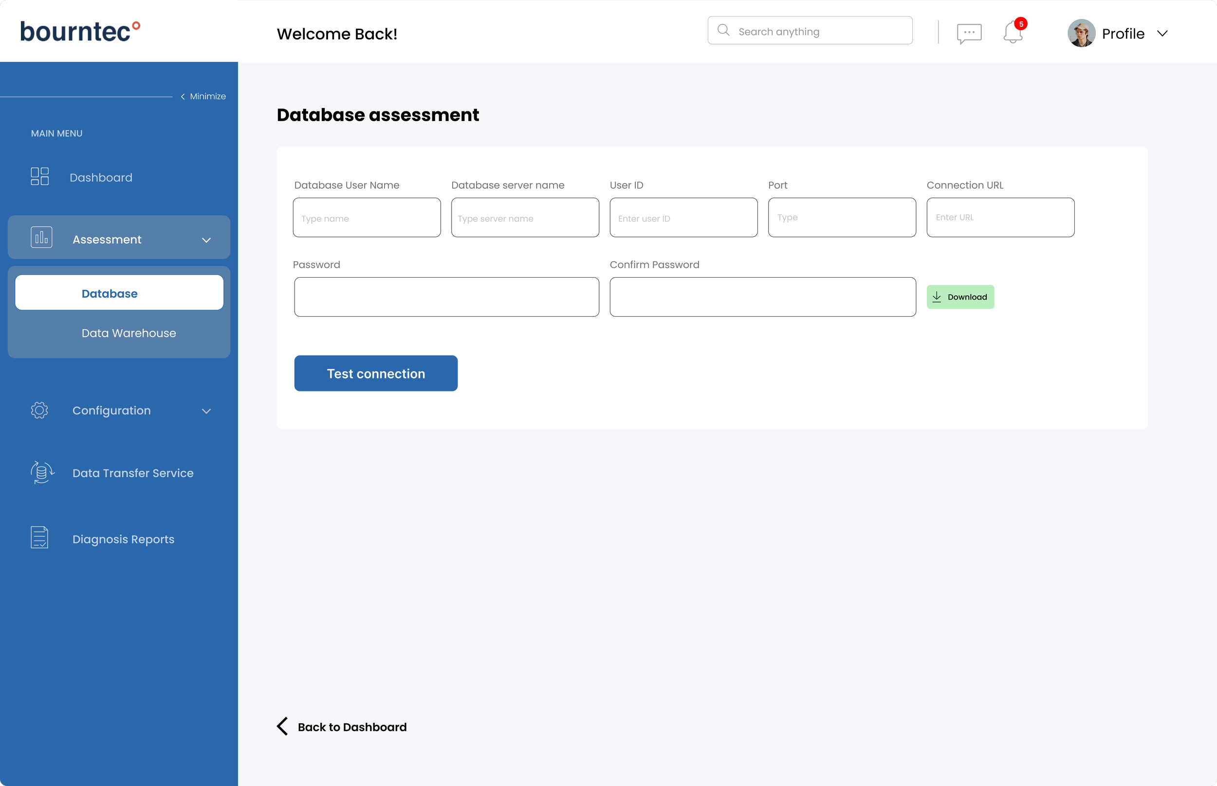
Login & assessment page flows
FINAL REVIEW
The Solution
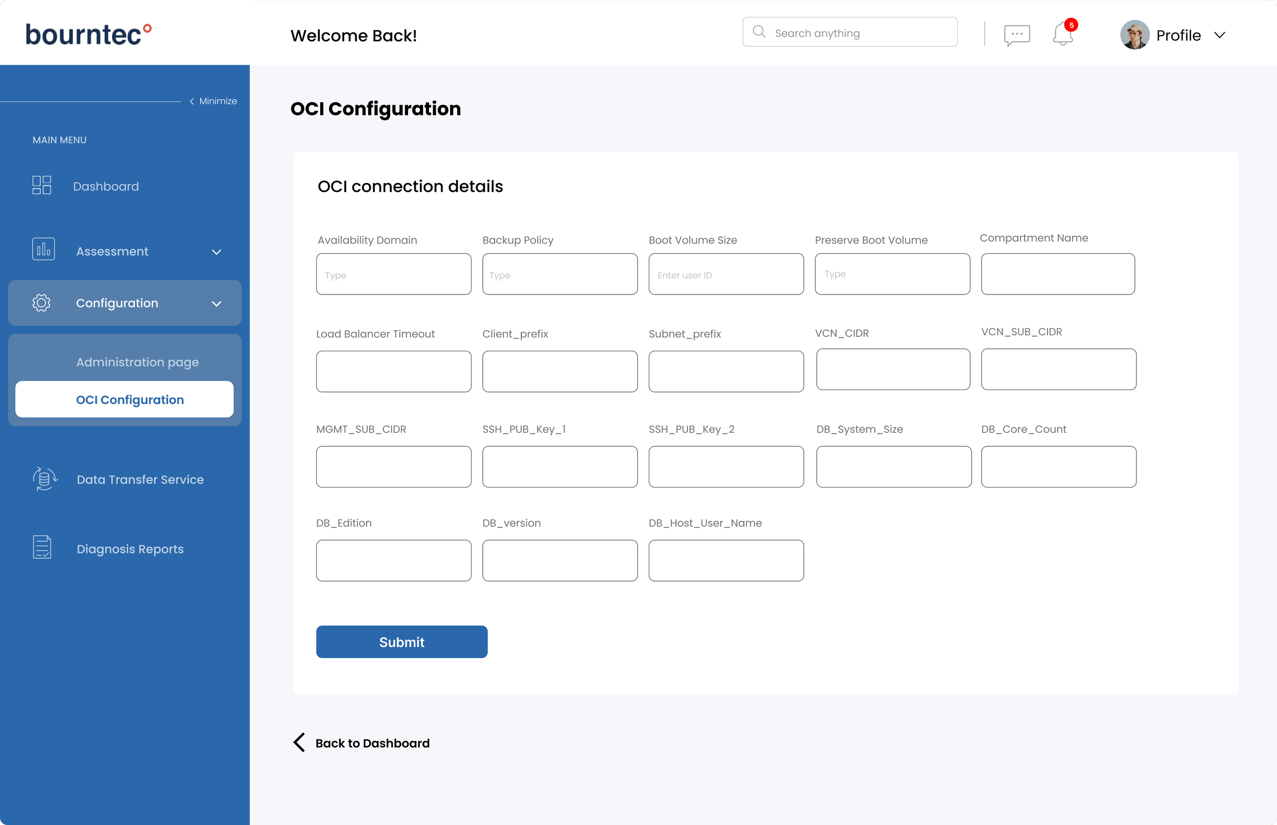
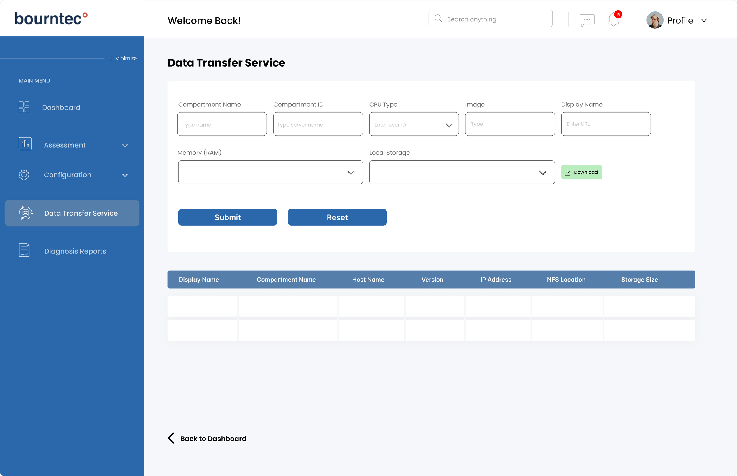
The objective was to create a fully functional, high-fidelity prototype of the dashboard that not only visualized the data effectively but also provided an intuitive user experience. This involved translating complex technical requirements into a user-friendly interface, ensuring that all essential features were easily accessible and visually coherent.
1.
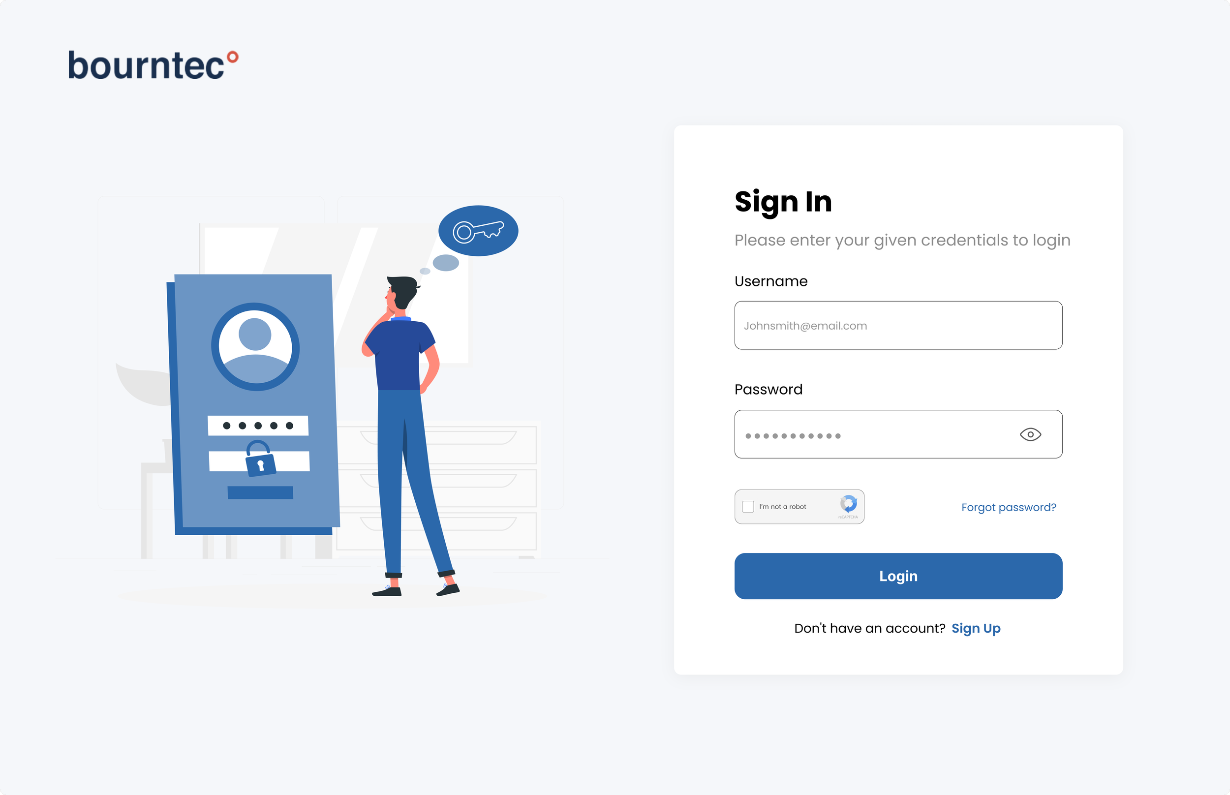
Login screens
Minimizing steps while maintaining a consistent visual design creates a seamless login process.
2.
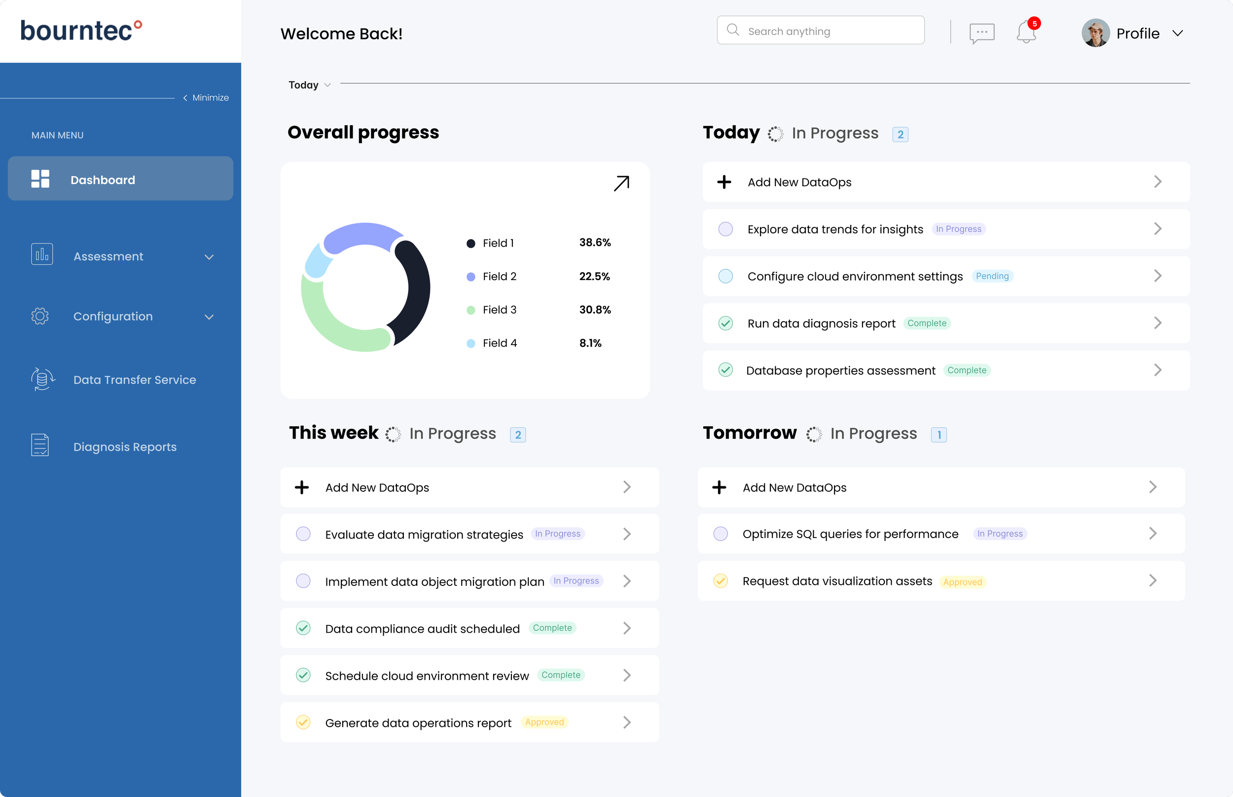
Dashboard landing page
I designed a simple landing page that helps customers track progress and manage pending tasks
ALL SCREENS

