Introduction
State Bank of India (SBI) is the largest public sector bank in India, serving millions of customers globally with a wide range of banking services, including personal and corporate banking, loans, and digital financial solutions. For my UX design case study, I focused on redesigning a critical component of their digital platform, ensuring a balance between security and ease of use to improve the overall customer experience.
Role
User research, wireframes, prototype
Team
1 Mentor, 1 UX Designer (me),

THE CONTEXT
Improve two factor authentication for State Bank of India to enhance security without sacrificing UX
My experience with SBI Online hasn’t been very smooth. The struggle started right at the login screen. The interface was confusing, and important error messages were unclear, making it hard to understand what went wrong.
One day, I was helping someone try online banking for the first time. Watching them struggle with the same issues I had faced gave me a fresh perspective. The frustration was immediate, and I found myself stepping in just to get through the basic steps.
That moment stuck with me. I decided to redesign the interface, focusing on making it simpler and faster for everyday users. It became one of my first design projects—breaking down each pain point, understanding the root problems, and building a solution that actually worked for real people.
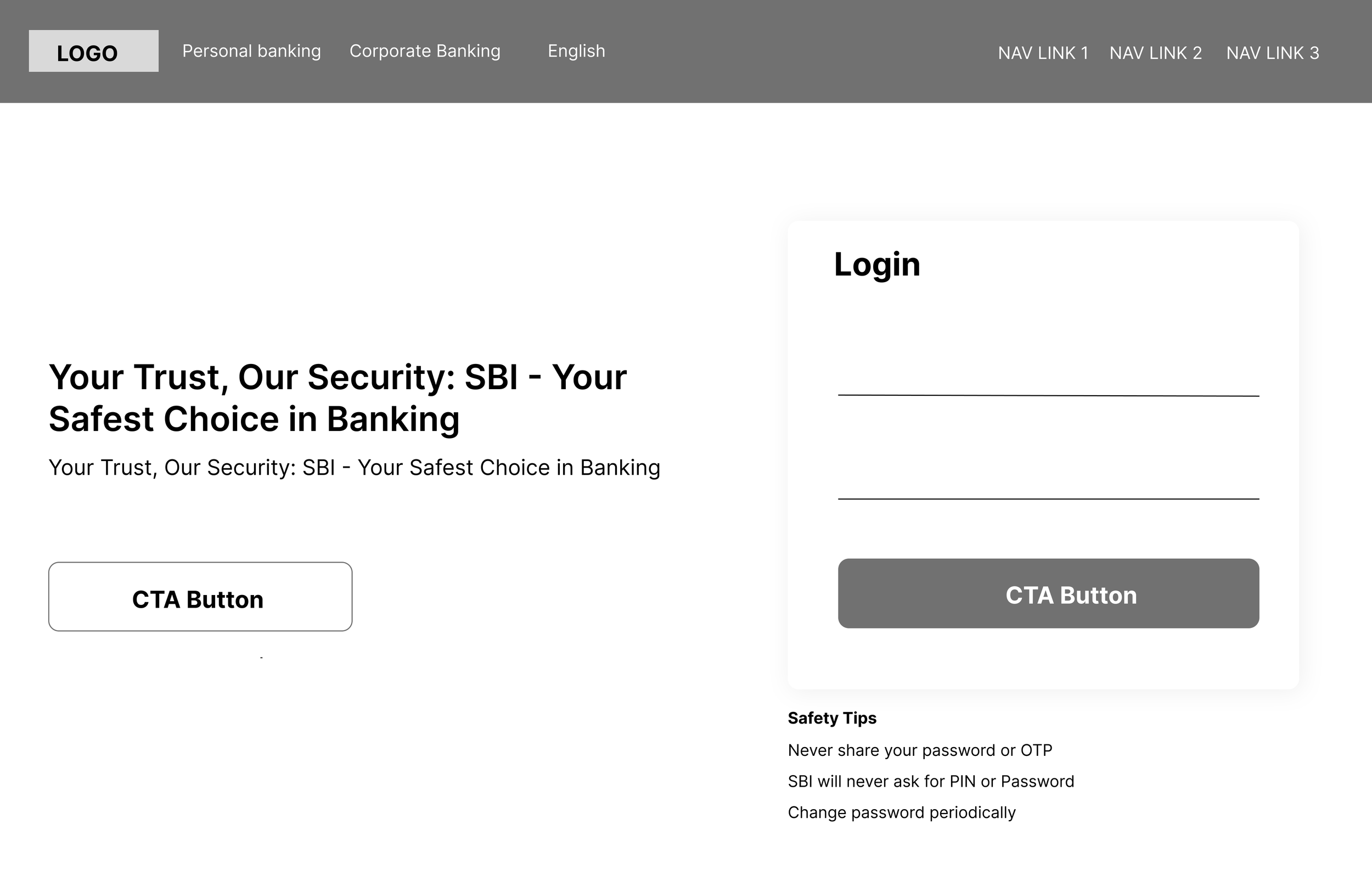
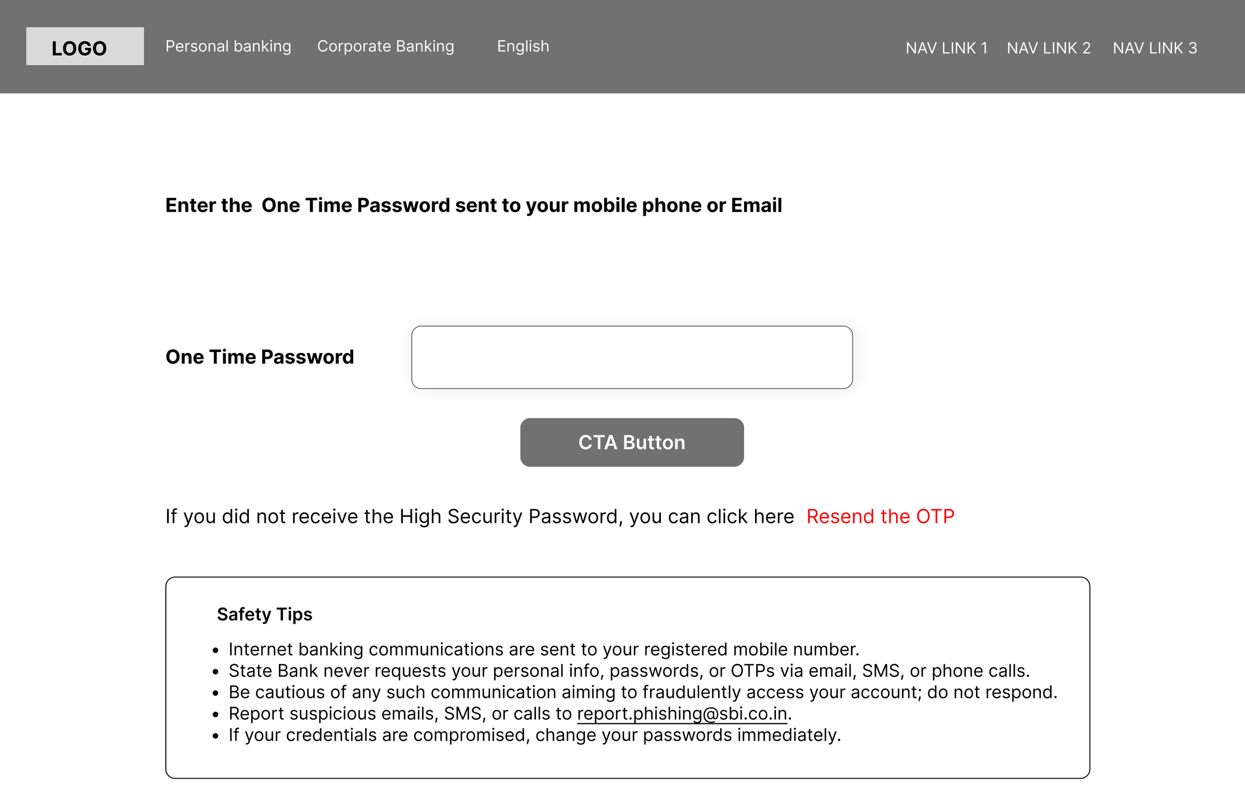
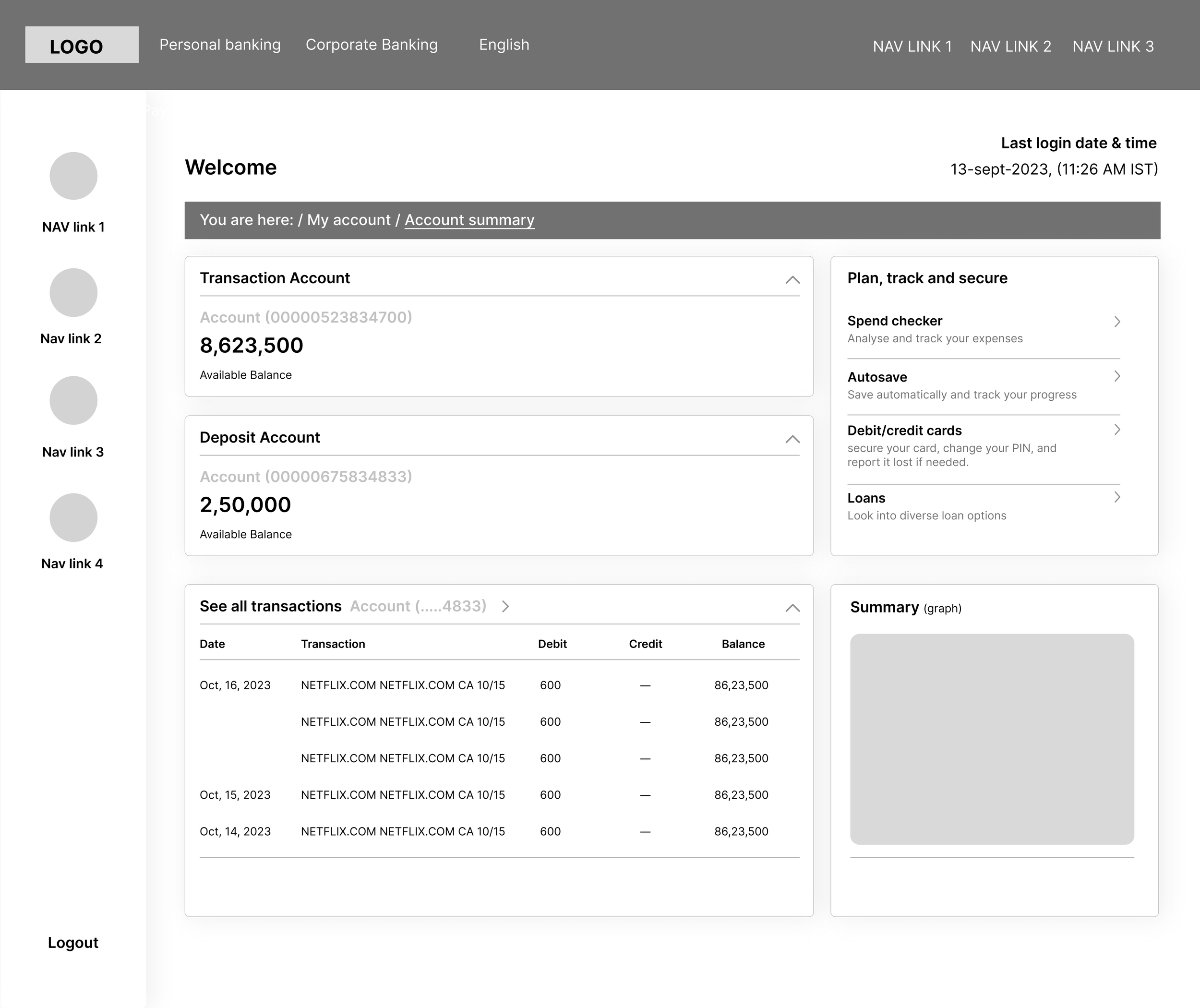
WHERE WE STARTED
I started by documenting each issue I noticed throughout the login process, organizing them in the order they appeared. The current user flow on the site is as follows:

THE RESEARCH
I conducted a competitor analysis to understand market trends and common features in financial tech platforms. Next, I evaluated the current SBI Online site to spot issues in the user experience. I also conducted five interviews with SBI users and gathered survey feedback from 20 more individuals. These insights guided my design decisions and helped me focus on user needs.

DEMOGRAPHIC INFORMATION
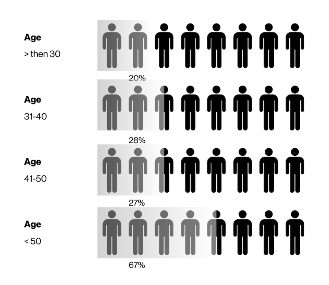
I specifically focused on users aged 50 and above, as data showed this age group represents the average SBI user demographic. Many in this group have limited familiarity with the internet and emerging technologies, which can impact their experience with digital banking. By targeting this demographic, I aimed to gain insights into their interactions with the site and identify key pain points they encounter.
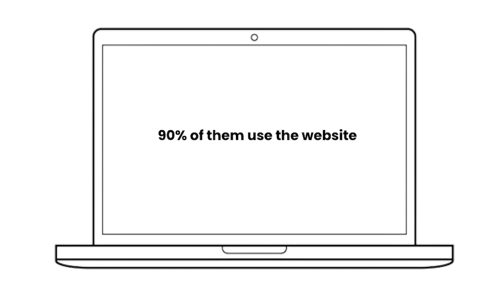
Customers use the website to interact with the site. They also relied on their own experiences and mental model which the current site did not meet.
What does the research tell us?
Users found the login process too long and complicated, with too many steps and pages causing frustration.
Most users were 50+ and were not familiar with the internet & technology
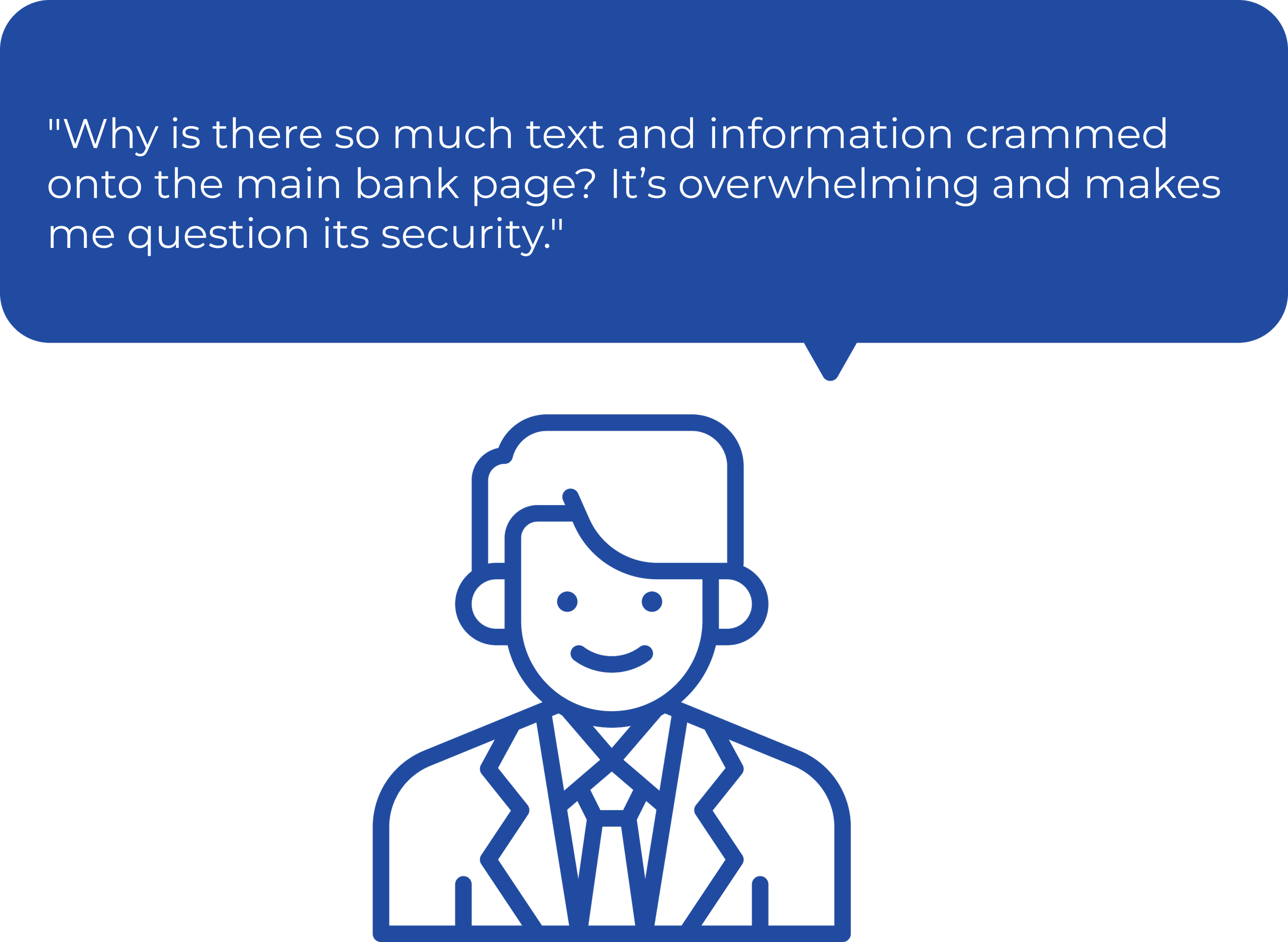
Many thought the landing page looked crowded and outdated, lacking a clear focus on important information.
Users were confused by the navigation, questioning why there were three separate navigation bars.
WIREFRAMING
After defining the problem and redesign goals I worked on lofi wireframes.
When I started designing the wireframes, I wanted to tackle the main frustrations users had shared. First, I focused on making the login process faster and easier, cutting out extra steps so users could log in without the usual hassle. I also aimed to clean up the landing page, so important information would stand out rather than get lost in clutter. Finally, I looked at the navigation—it felt confusing with so many options split across multiple bars—so I worked on organizing it in a way that would feel clear and straightforward.

FINAL REVIEW
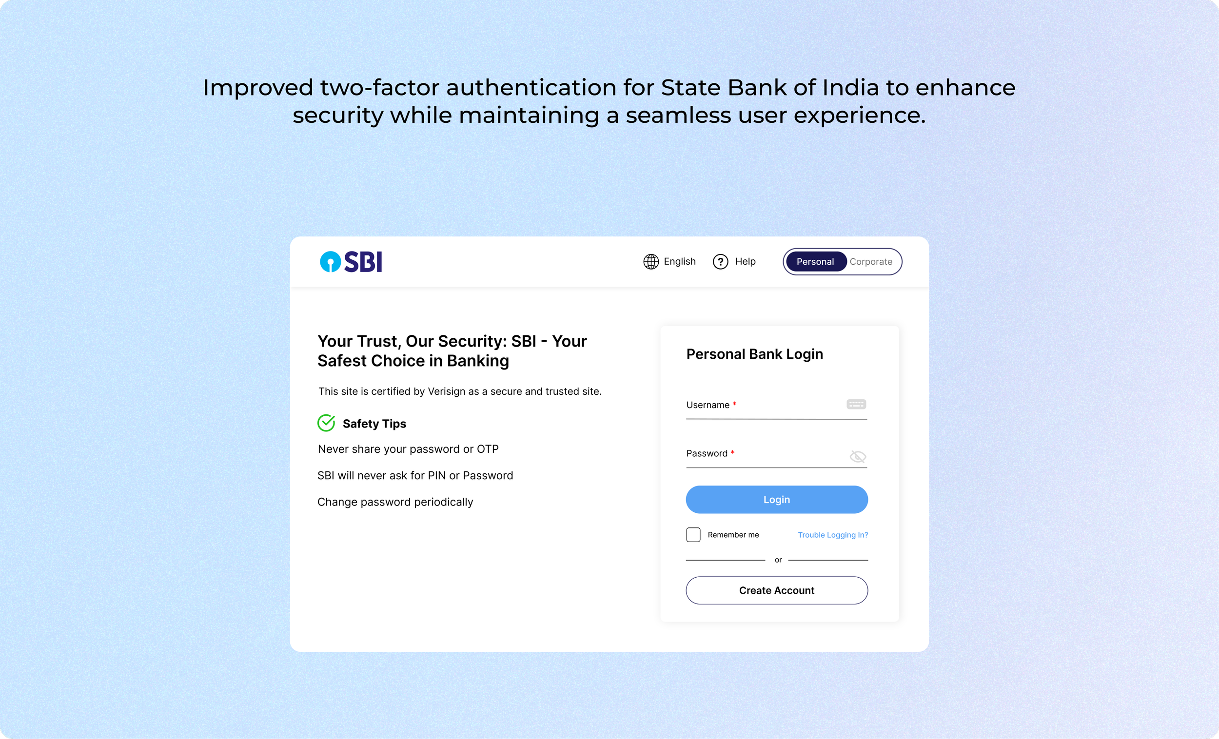
The Solution
After weeks of testing and development here are the recommendations. I created high-fidelity prototypes on Figma based on the feedback received from testing.
1.
Quick and easy login
Minimizing steps while maintaining a consistent visual design creates a seamless login process.
2.
Toggle button to switch between portals
I added a toggle button to the navigation bar to differentiate between "personal" and "corporate" banking. Each option directs users to separate login portals, allowing them to easily switch between portals.
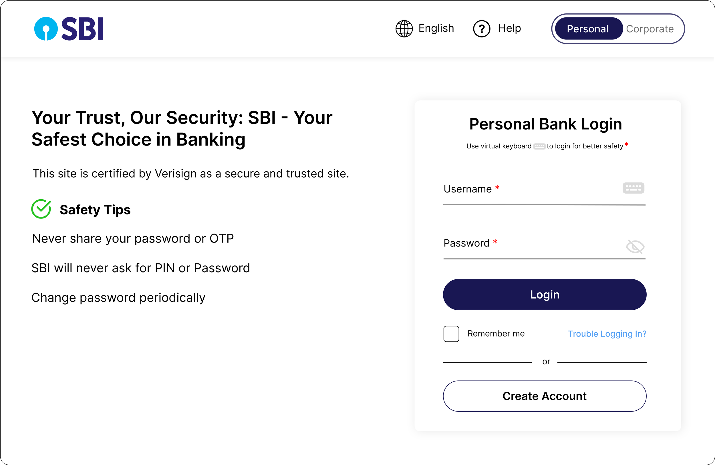
3.
Clear Instructions for Safe Login
To make the virtual keyboard more visible, a clear instruction was added at the top to explain its purpose. A "remember me" feature was also introduced for users who prefer a faster login process.